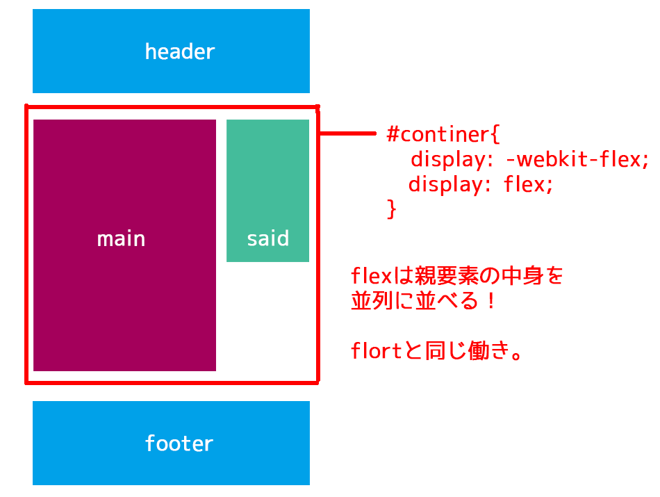
−フレックスボックス(フレキシブルボックス)−
フレックスボックス(フレキシブルボックス)
ある要素に定義するだけで、その直下の要素が並列になる便利なスタイルです。
CSSで「display:flex」というスタイルを指定するだけです。
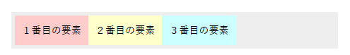
<<HTML>>
<ul>
    <li>1番目の要素</li>
    <li>2番目の要素</li>
    <li>3番目の要素</li>
</ul>


<<CSS>>
ul {
	display: -webkit-flex;
	display: flex;
}
中央よせ
<<CSS>>
ul {
display: -webkit-flex;
display: flex;
-webkit-justify-content: center;
justify-content: center;
-webkit-align-items: center;
align-items: center;
height: 200px;
}
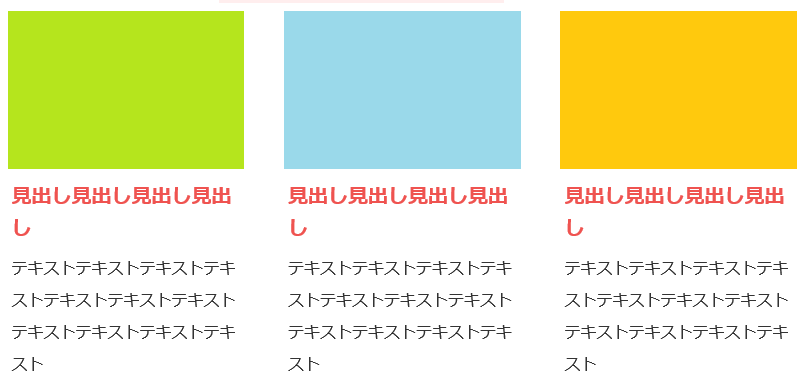
計算式で3件表示
.houhou-box{
display: -webkit-flex;
display: flex;
flex-wrap:wrap;
align-items:flex-start;
justify-content: space-between;
}
.houhou-box .style{
width : -webkit-calc(100% / 3 - 5px) ;
width : calc(100% / 3 - 5px) ;
border:solid 1px #999999;
margin:0px 5px 20px 0px;
}
.houhou-box .style:nth-child(3n){
margin-right:0px;
}
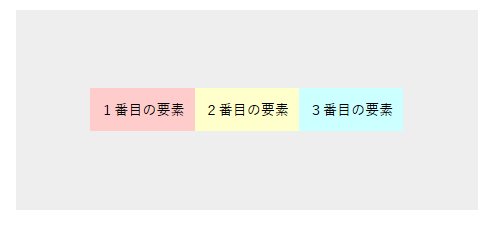
中央寄せは、並列の場合の左右方向は
justify-content: center;
で、上下方向は
align-items: center;
で指定します。
均等に配置
justify-content: space-between;
.items {
  display: flex;
  justify-content: space-between;
}
.items .item {
  width: 30%;
}
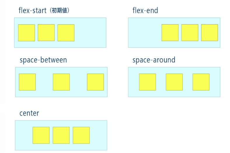
justify-contentは、水平方向の位置を指定できるプロパティです。下のように、5種類あります。
| flex-start(初期値) | justify-content: flex-start; |
|---|---|
| flex-end | 右寄せ |
| space-between | 均等配置 |
| space-around | 均等配置? |
| center | 中央配置 |
均等配置で最後の行だけ左寄せ
<div class="flex_box">
 <div class="box">コンテンツ内容</div>
 <div class="box">コンテンツ内容</div>
 <div class="box">コンテンツ内容</div>
 <div class="box">コンテンツ内容</div>
 <div class="box">コンテンツ内容</div>
</div>


【CSS】
.flex_box {
	width: 1000px;
	display: flex;
	justify-content: space-between;
	flex-wrap: wrap;
}


.box {
	width: 300px;
	background: #fdfd64;
	margin-bottom: 3%;
	text-align: center;
	padding: 10% 0;
}


.flex_box:after {
	display: block;
	content:"";
	width: 300px;/*幅を上と同じにする*/
}
| 縦並びに変更する場合 | flex-direction: column; |
|---|---|
| 改行 | flex-wrap: wrap; |
| 中央配置 | justify-content: space-between; |
| 奇数だけ逆向き:画像が逆になるやつ | flex-direction: row-reverse; |
| 順番を左右入れ替え | order:1; |
固定する方法
position: sticky; でスクロールしたいボックスを固定する。
.sticky {
	postion: -webkit-sticky;
	position: sticky;
	top:0px;
}
jQuery(function($) {
    // header ナビゲーションを固定している場合
    // ナビメニュー分の高さを取得する。
    var nav_h   = $('nav').innerHeight();

    // サイドバーの要素
    var $sideber = $('.sideber');
    // サイドバーの子要素
    var $s_ul    = $('ul', $sideber);
    var $s_p     = $('p', $sideber);
    // ラッパー要素
    var $wrap    = $('.content_wrap');
    // ラッパー要素幅
    var wrap_w   = $wrap.innerWidth();
    // 追尾終了する要素
    var $footer  = $('footer');
    var sideber_position = function() {

        // Scroll値
        var scroll         = $(document).scrollTop();

        // サイドバーの高さ
        // flexを使用して、position: static の場合、サイドバーの高さが変わるため子要素で取っている
        var sideber_h      = $s_ul.innerHeight() + $s_p.innerHeight();

        // サイドバーのラッパーのOffset値
        var wrap_t         = $wrap.offset().top;
        // 追尾終了する要素のOffset値
        var foot_t         = $footer.offset().top;
        // Absolute指定する値
        var ab_bottom      = foot_t - nav_h - sideber_h;
        // ブラウザサイズ
        var vw             = window.innerWidth;
        // Fixed指定の際のright量
        // ラッパー幅の1/2、Window幅がラッパー幅より小さければマイナス
        var sidebar_r = vw > wrap_w ? (vw - wrap_w) / 2 : vw - wrap_w;

        // Absolute指定値(追尾終了値)
        if (ab_bottom < scroll) {
            $sideber.css({
                'position': 'absolute',
                'top': 'initial',
                'right': 0,
                'bottom': 0
            });
        // Fixed指定値(追尾中値)
        } else if (wrap_t - nav_h < scroll) {
            $sideber.css({
                'position': 'fixed',
                'top': 140,
                'right': sidebar_r + $(window).scrollLeft(),
                'bottom': 'initial',
            });
        // Static指定
        } else {
            $sideber.css({
                'position': 'static'
            });
        }
    };

    // Load時
    $(document).on('load', function() {
        sideber_position();
    });
    // Scroll, Resize時
    $(window).on('scroll resize', function() {
        sideber_position();
    });
});
