−グローバルナビ−
トルグメニュー
必要な設定は
<link rel="stylesheet" type="text/css" href="<?php echo get_template_directory_uri(); ?>/css/drawer.min.css" media="all" />

<script src="https://ajax.googleapis.com/ajax/libs/jquery/1.11.3/jquery.min.js"></script>
<script src="https://cdnjs.cloudflare.com/ajax/libs/iScroll/5.1.3/iscroll.min.js"></script>
<script src="https://cdn.rawgit.com/ungki/bootstrap.dropdown/3.3.5/dropdown.min.js"></script>
<script src="<?php echo get_template_directory_uri(); ?>/css/drawer.min.js"></script>
<script type="text/javascript" src="<?php echo get_template_directory_uri(); ?>/javascript.js"></script>
ヘッダ関連のドキュメント宣言はこのままコピペ
<!DOCTYPE html>
<html>
<head>
	<!--[if lt IE 9]><script src="http://html5shiv.googlecode.com/svn/trunk/html5.js"></script><![endif]-->
	<meta charset="UTF-8" />
	<meta name="viewport" content="width=device-width,initial-scale=1.0">
	<title><?php the_title(); ?>|<?php bloginfo(‘title’); ?></title>
	<link rel="stylesheet" type="text/css" href="<?php echo get_template_directory_uri(); ?>/style.css" media="all" />
	<link rel="stylesheet" type="text/css" href="<?php echo get_template_directory_uri(); ?>/style-pc.css" media="all" />
	<link rel="stylesheet" type="text/css" href="<?php echo get_template_directory_uri(); ?>/style-mobile.css" media="all" />
	<link rel="stylesheet" type="text/css" href="<?php echo get_template_directory_uri(); ?>/css/drawer.min.css" media="all" />
	<?php if ( is_front_page() ) : ?>
		<link rel="stylesheet" type="text/css" href="<?php echo get_template_directory_uri(); ?>/style-top.css" media="all" />
	<?php else: ?>
		<link rel="stylesheet" type="text/css" href="<?php echo get_template_directory_uri(); ?>/style-sub.css" media="all" />
	<?php endif; ?>
	<link rel="alternate" type="application/rss+xml" title="<?php bloginfo('name'); ?> RSS Feed" href="<?php bloginfo('rss2_url'); ?>" />
	<link rel="alternate" type="application/atom+xml" title="<?php bloginfo('name'); ?> Atom Feed" href="<?php bloginfo('atom_url'); ?>" />
	<link rel="pingback" href="<?php bloginfo('pingback_url'); ?>" />
	<!-- jquery & iScroll -->
	<script src="https://ajax.googleapis.com/ajax/libs/jquery/1.11.3/jquery.min.js"></script>
	<script src="https://cdnjs.cloudflare.com/ajax/libs/iScroll/5.1.3/iscroll.min.js"></script>
	<script src="https://cdn.rawgit.com/ungki/bootstrap.dropdown/3.3.5/dropdown.min.js"></script>
	<script src="<?php echo get_template_directory_uri(); ?>/css/drawer.min.js"></script>
	<script type="text/javascript" src="<?php echo get_template_directory_uri(); ?>/javascript.js"></script>
	<?php wp_head(); ?>
</head>
<HTMLナビ設定>
<!--グローバルナビ-->
<!-- ハンバーガーボタン -->
<button type="button" class="drawer-toggle drawer-hamburger"><span class="ffsmall">メニュー</span>
<span class="sr-only">toggle navigation</span>
<span class="drawer-hamburger-icon"></span>
</button>
<nav class="drawer-nav">
<ul class="drawer-menu menubox">
<!-- ドロワーメニューの中身 -->
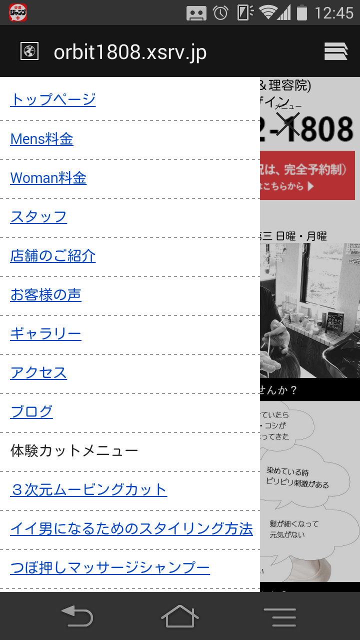
<li><a href="http://orbit1808.xsrv.jp/">トップページ</a></li>
<li><a href="http://orbit1808.xsrv.jp/menu/mens">Mens料金</a></li>
<li><a href="http://orbit1808.xsrv.jp/menu/woman">Woman料金</a></li>
<li class="cuttext">体験カットメニュー</li>
<li><a href="http://orbit1808.xsrv.jp/menu/cutstyle1">3次元ムービングカット</a></li>
<li><a href="http://orbit1808.xsrv.jp/menu/cutstyle2">イイ男になるためのスタイリング方法</a></li>
<li><a href="http://orbit1808.xsrv.jp/menu/cutstyle3">つぼ押しマッサージシャンプー</a></li>
</ul>
</nav>
※注意!!!
忘れてならないのはbody宣言を書き換える事!
<body class="drawer drawer--left">
<CSS>
/*グローバルナビ*/
/*--------------------------------------------------------
sidemenu-global-nav-containerグローバルナビ
--------------------------------------------------------*/
.drawer-toggle{margin-top:0px;}
.ffsmall{font-size:7px;}
.menubox{text-align:left!important; padding-top:10px!important;}
.menubox li{
margin-bottom:5px;
border-bottom:dashed 1px #999999;
padding:2px 0px 8px 10px;
}
<JavaScript>
//トルグメニュー
$(document).ready(function() {
$('.drawer').drawer();
});
CSSダウンロード
シンプルナビメニュー
<HTML>
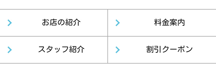
<ul class="none global-nav">
<li class="arrow"><a href="http://www.nac-cs.jp/menu/information">お店の紹介</a></li>
<li class="arrow"><a href="http://www.nac-cs.jp/menu/charge">料金案内</a></li>
<li class="arrow"><a href="http://www.nac-cs.jp/menu/staff">スタッフ紹介</a></li>
<li class="arrow"><a href="http://www.nac-cs.jp/menu/coupon">割引クーポン</a></li>
</ul>
<CSS>
/*フッターなび*/
.global-nav {
margin: 0 0 30px;
padding: 0;
border-top: 1px solid #aaa;
font-size: 13px;
list-style-type: none;
}
/*clearfix*/
.global-nav:after {
content: "";
clear: both;
display: block;
}
.global-nav li {
float: left;
width: 50%;
text-align: center;
border-bottom: 1px solid #aaa;
-webkit-box-sizing: border-box;
-moz-box-sizing: border-box;
box-sizing: border-box;
}
/*奇数のli要素に適応*/
.global-nav li:nth-child(odd) {
border-right: 1px solid #aaa;
}
.global-nav a {
display: block;
line-height: 44px;
color: #000;
text-decoration: none;
}
.global-nav a:hover {
color: #000;
background: #e6e6e6;
}
.arrow{
position: relative;
display: inline-block;
padding-left: 25px;
}
.arrow::before{
content: '';
width: 6px;
height: 6px;
border: 0px;
border-top: solid 2px #5bc0de;
border-right: solid 2px #5bc0de;
-ms-transform: rotate(45deg);
-webkit-transform: rotate(45deg);
transform: rotate(45deg);
position: absolute;
top: 50%;
left: 10px;
margin-top: -4px;
}
基本のナビ
/*--------------------------------------------------------
menu-global-nav-containerグローバルナビ
--------------------------------------------------------*/
.menu-global-nav-container ul{
	list-style:none;
	border-top: 1px solid #ccc;
}
.menu-global-nav-container ul li{
	background-image: -webkit-gradient(linear, 0% 0%, 0% 100%, from(#fff), to(#f0f0f0));
	background: linear-gradient(#fff, #f0f0f0);
	border-top: none;
	border-bottom: 1px solid #ccc;
	border-left: 1px solid #ccc;
	border-right: 1px solid #ccc;
	height: 30px;
	margin: 0px;
}
.menu-global-nav-container ul li:nth-child(odd) {
	float: left;
	width: 50%;
}
.menu-global-nav-container ul li a{
	color: #666;
	display: block;
	position: relative;
	height: 30px;
	margin: 0px;
	padding: 0px 20px 0 10px;
	overflow: hidden;
	white-space: nowrap;
	text-overflow: ellipsis;
	text-decoration: none;
}


.menu-global-nav-container ul li a:after { ここで矢印のデザインを作っている!
	content: "";
	position: absolute;
	top: 50%;
	right: 10px;
	width: 6px;
	height: 6px;
	margin: -4px 0 0 0;
	border-top: solid 2px #666;
	border-right: solid 2px #666;
	-webkit-transform: rotate(45deg);
	transform: rotate(45deg);
}
折り畳み式のナビゲーション
タップするとページが出てくる。こちらの方が利便性があるかも。
<span class="menu-toggle"><i class="blogicon-reorder lg"></i>MENU</span>
<ul id='menu'>
<li><a href='url'>TOP</a></li>
<li><a href='url'>カテゴリ1</a></li>
<li><a href='url'>カテゴリ2</a></li>
<li><a href='url'>カテゴリ3</a></li>
<li><a href='url'>カテゴリ4</a></li>
<li><a href='url'>カテゴリ5</a></li>
<li><a href='url'>カテゴリ6</a></li>
<li><a href='url'>カテゴリ7</a></li>
</ul>

<style type="text/css">
#top-editarea{
 background: #dcdcdc;/*外側の背景*/
 text-align: right;/*MENUの文字の位置*/
}
#top-editarea .section{
 margin: 0;
 width: 100%;
}
.menu-toggle{
 color: #444444;/*MENUの文字色*/
 display: inline-block;
 padding: 5px;
}
#menu {
 display: none;
 padding: 0;
 margin: 0;
}
#menu li{
 list-style-type: none;
 background: #f5f5f5;/*リストの背景色*/
 margin: 0 auto;
}
#menu li a {
 color: #444444;/*リストの文字色*/
 font-weight: bold;
 display: block;
 padding: 7px;
 text-align: left;/*リストの文字の位置*/
}
</style>

<script type="text/javascript" src="http://code.jquery.com/jquery-1.9.1.min.js"></script>
<script>
$(function(){
    $(".menu-toggle").on("click", function() {
        $(this).next().slideToggle();
    });
});
</script>
jqueryはいつも指定しているものでOK。
.menu-toggle で指定した部分がクリックすると開閉するようになる。
そしてその中の menu 部分が実際に開閉する。最初は出ているので、 display:none; で見えなくしてあげる。
折り畳み式のナビゲーション
タップするとページが出てくる
<!--グローバルナビ-->
<div class="menu">
<label for="Panel34"><h2>メニュー</h2></label>
<input type="checkbox" id="Panel34" class="on-off" /><ul>
	<li><a href="#">メニュー1</a></li>
	<li><a href="#">メニュー2</a></li>
	<li><a href="#">メニュー3</a></li>
</ul>
</div><!--グローバルナビ-->


/*--------------------------------------------------------
menu-global-nav-containerグローバルナビ
--------------------------------------------------------*/
label {
    background:#727272;
    color: #fff;
    padding: 6px;
    display: block;
    margin: 0;
}
.menu h2{
	background-image:url(http://flow-mind.com/wp-content/themes/flow-mind/img/icon-menu.png);
	background-repeat:no-repeat;
	background-size:contain;
	padding-left:20px;
}

input[type="checkbox"].on-off{
    display: none;
}

.menu{text-align:left;}
.menu ul {
    -webkit-transition: all 0.5s;
    -moz-transition: all 0.5s;
    -ms-transition: all 0.5s;
    -o-transition: all 0.5s;
    transition: all 0.5s;
    margin-left: 20px;
    padding: 0;
}
.menu ul li{list-style:disc;}
.menu input[type="checkbox"].on-off:checked + ul{height: 350px;}/*ここでパネルの長さを決める*/
.menu a{display:block;}

.menu li{padding: 3px;}

.menu input[type="checkbox"].on-off + ul{
    height: 0;
    overflow: hidden;
}
ページTOPのデザイン
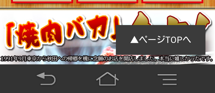
/*--------------------------------------------------------
ページトップ
--------------------------------------------------------*/

#page-top{
  width:100%;
  height:40px;
  position:fixed;
  right:0px;
  bottom:0px;
  display:none;
  z-index:5;
}

#page-top p{
  margin:0;
  padding:0;
  text-align:center;
  background:#434343;
}

#page-top p:hover{
  background:#434343;
  -webkit-transition:all 0.3s;
  -moz-transition:all 0.3s;
  transition:all 0.3s;
}

#page-top p a{
  color:#fff;
  line-height:40px;
  text-decoration:none;
  display:block;
  cursor:pointer;
}


.page-top:not(\*|*){ position: static; }/* Opera9以下 */
